

Alexandra Kinga Fekete for Booklet

Elizabeth Toll for Maxi
these are really classic, meticulously styled homages to what I would interpret as Victorian era or modern Amish lifestyle, however although there is a somewhat 'Americana' feel, they still strike me as a touch European, Nordic or northwestern European. The flowering water grasses with white puffs really draw the eye and play along with the grass greens and reflected blues and cloud grays with a touch of black to tie everything in. in the second the posing and capture are very tranquil while still being adventurous, and the dark crimson of the boat tie everything in.

Ian Derry for Milk
Ian Derry for Milk
I have to say, I love Milk magazine, its a french language children's mode publication. I have always loved well dressed children, whether it be by their own personal choice, or their parents doing. Nothing is cuter than little kids with a few baby teeth missing in Dior ads. The magazine also has a bit of substance to it, with articles on parenting tips, dealing with children with learning disabilities, interior design and product reviews for children's rooms and things of the like, its not at all like American parenting magazines that teach mothers how to make jack-o-lantern cupcakes. I know ill be a subscriber to magazines like this when I have children.

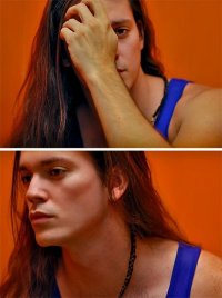
Jimmy Backius for Tush

Jorgen Brennicke for Booklet


Kourtney Ross "Schloß Lanke" for Booklet
Jimmy Backius for Tush
Jorgen Brennicke for Booklet
Kourtney Ross "Schloß Lanke" for Booklet
I really like these really well lit portraits at German castle Schloß Lanke. I most enjoy the first and last shots in which the male character is individually lit, it is not harsh or wildly obvious which I appreciate. The colours are well chosen, the girl is beautiful, and it does have a very antiquated feel while still maintaining modern tactics, which i think its a victory for the idea of blending eras. I don't at all enjoy homage pieces that are too far vintage, or too far modern, its a delicate balance to be able to properly represent inspiration from elder periods yet remain modern. My favourite part, and i always look for this, is that there aren't any distracting elements, the backgrounds and framing and cropping are well done, I really dislike when they are done poorly because it takes the focus away from the entire concept, like for instance when less experienced or discerning photographers take portraits in urban settings and somehow don't see the ugly car sitting way in the background. the only gripe I have is the 'light pole' in the second image on the very far left, but its balanced with another on the right side, and its not protruding out of any ones skull.

Kristian Schuller for 125
I am not sure if these are all done as extensive photoshop of individual pieces put into one, in which case, big applause, or whether they are all mannequins that were built with these facial expressions, in which case, big big applause, or whether its mannequins with photoshopped on faces of a model, in which case, applause. either way its done, i really enjoy the seamless nature of it. too many "here's me 500 times" pictures that some photographers are doing are really sloppily done.

Leo Krumbacher for Tush
I sometimes really like simple black and whites, but of course I like a bit of creativity involved, Ive never been too high on film/capture aesthetic quality carrying an image, as is the case with many B&W lovers' misjudgement of true creative value. The line quality and light values, and colour are really well ranged and deep, the skin tone is pristine and the models' facial structure is next to perfect. My favourite part though, is the hairstyle, and how the sharp, well defined comb lines play with the gentle striping in the garment.


Margaretha Olschewski for Grazia
Excuse me for almost using the same exact descriptions for this, and the Kourtney Ross "Schloß Lanke" for Booklet but again i really enjoy when something has somewhat of an homage to a certain period or lifestyle, yet is thoroughly modern in its execution. These really inherently remind me of Titanic era, or general mass immigration era but really have done a great job of fusing modern fashion with the class and elegance of the woman of old. I feel as if there was an obvious play to some of the baroque portraits in the second image of the first grouping, with her alabaster skin, striking natural makeup job and her hood/head covering. its classy and yet quite sexy at the same time, her clavicle, the flat portion of her chest and delicate shoulder structure along with her long thin neck and well chosen necklace piece is ultimate femininity. the picture to the left is undoubtedly erotic and yet completely respectful, something I appreciate as one who doesn't appreciate the "nude for nudes sake" style of work. And the bottom two images are really smartly coloured, the door, the rope tie offs, the Deutsche flag, and other orange/yellow, red and black elements that tie in perfectly with the flag. I really enjoy that she's not shes not part of that colour scheme, rather part of the image.


Oliver Rossi for J'N'C
What can i really say about these that Isn't so obvious, and I haven't said already about two other sets? Nothing much, I think you can see a trend developing here as far as my taste. What i can say is that i really think this is a very successful use of a rather bland colour pallet, and that i really enjoy the use of light peeking through.

Simone Kostian for Gioia Italy

Sven Jacobsen for Converse
No comments:
Post a Comment